Data Visualization
Digital
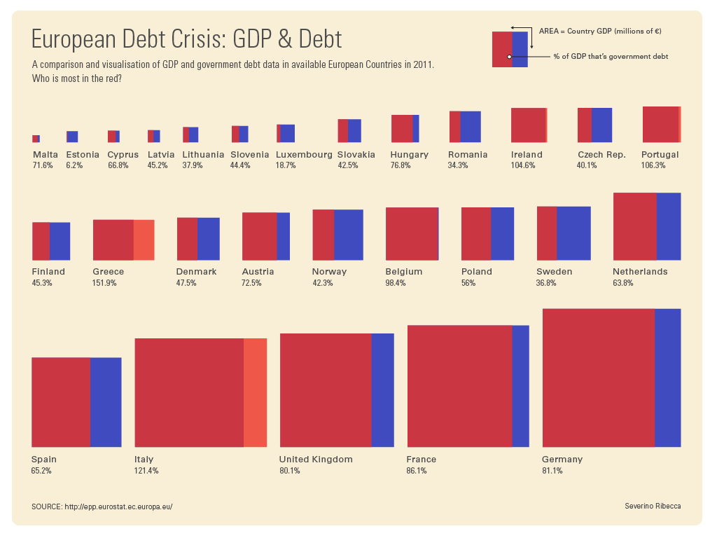
European Debt Crisis
This visualization is a version I redrew (with Processing) of the graphic I submitted to the first-ever Information is Beautiful Awards back in 2011, where I won the 3rd prize.
The challenge of the competition was to visualize or explain something about the financial crisis plaguing the World at the time. So using the data I found from eurostat, I looked at the relationship and ratio between the GDP and government debt of EU nations.

My solution was to use a square proportional area chart to visualise each country’s GDP and highlight the percentage of it that is debt in red. Nations with more debt to GDP had the percentage bar extend off its square’s area.
Client Name
Information is Beautiful Awards 2011
Role
Designer