Data Visualization
Infographic
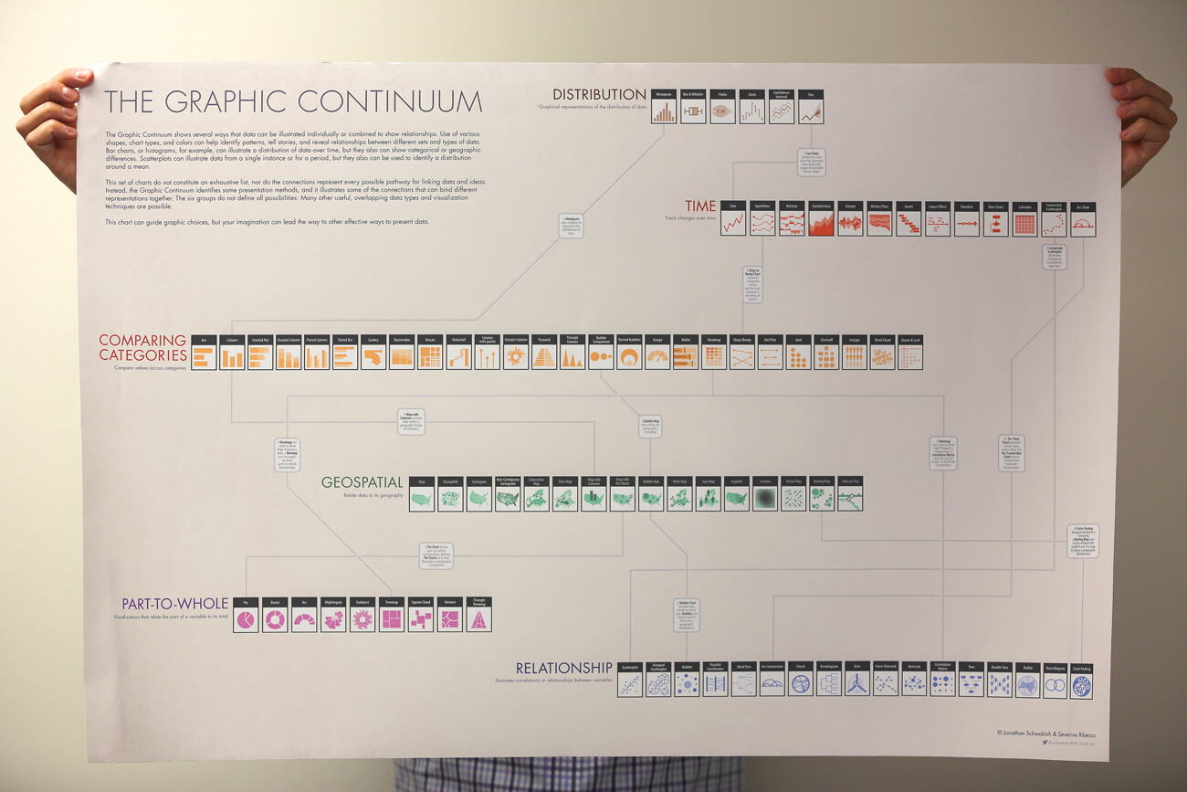
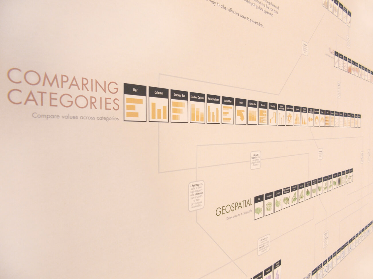
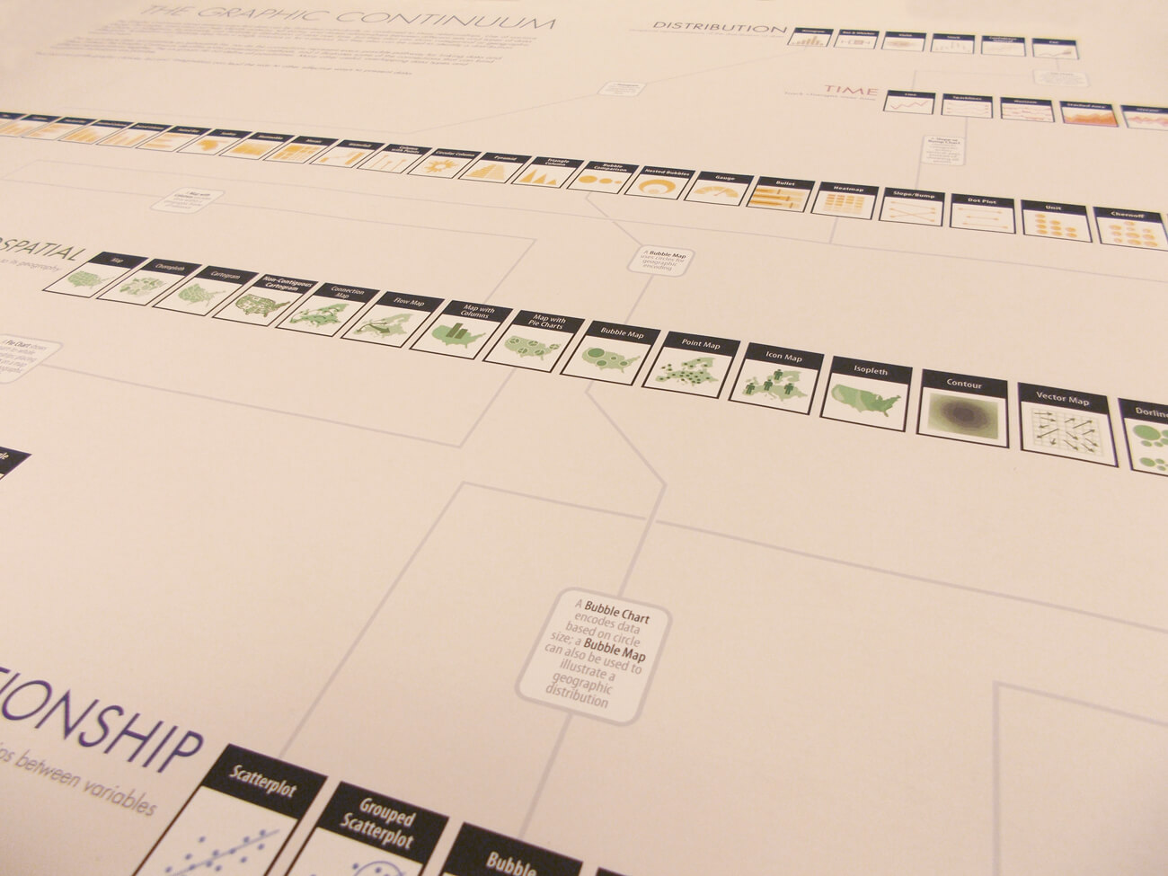
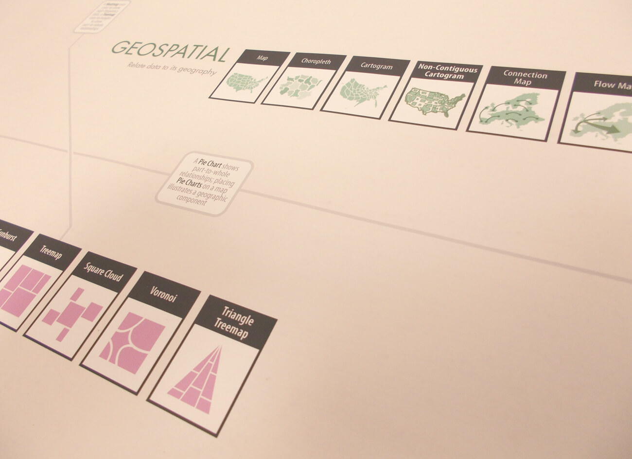
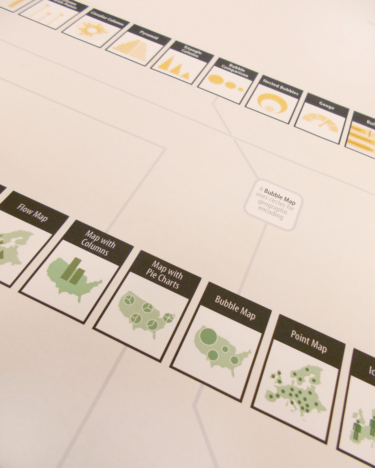
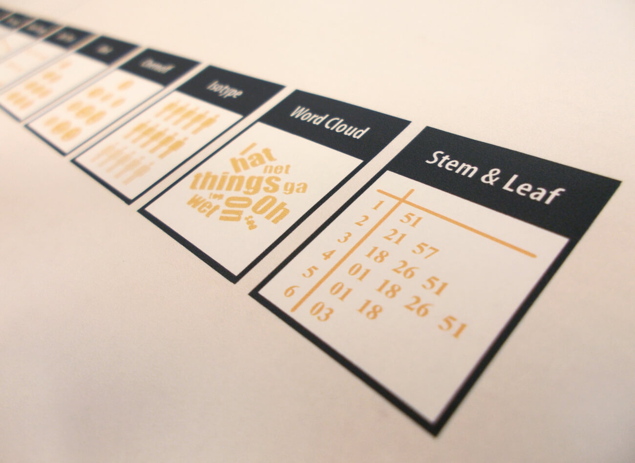
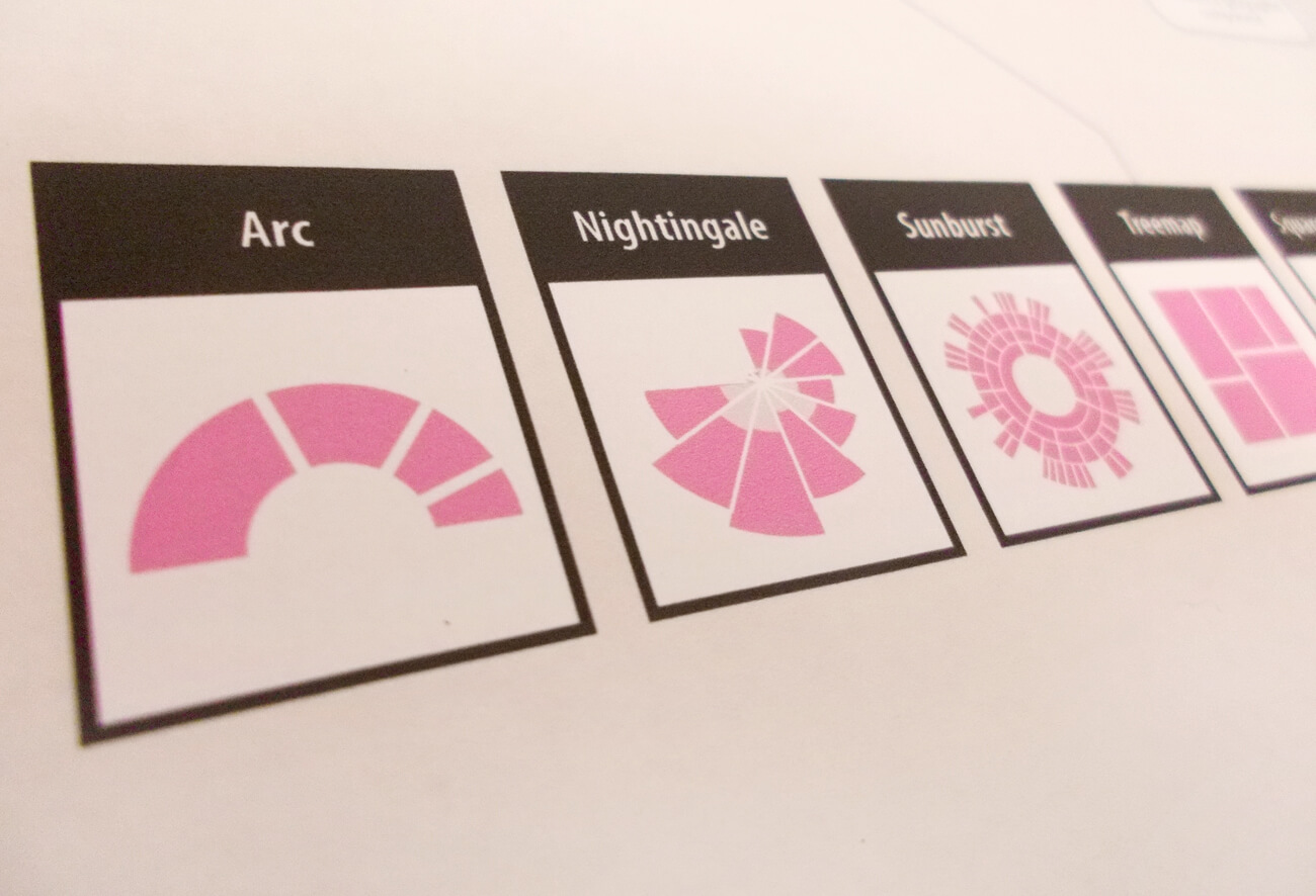
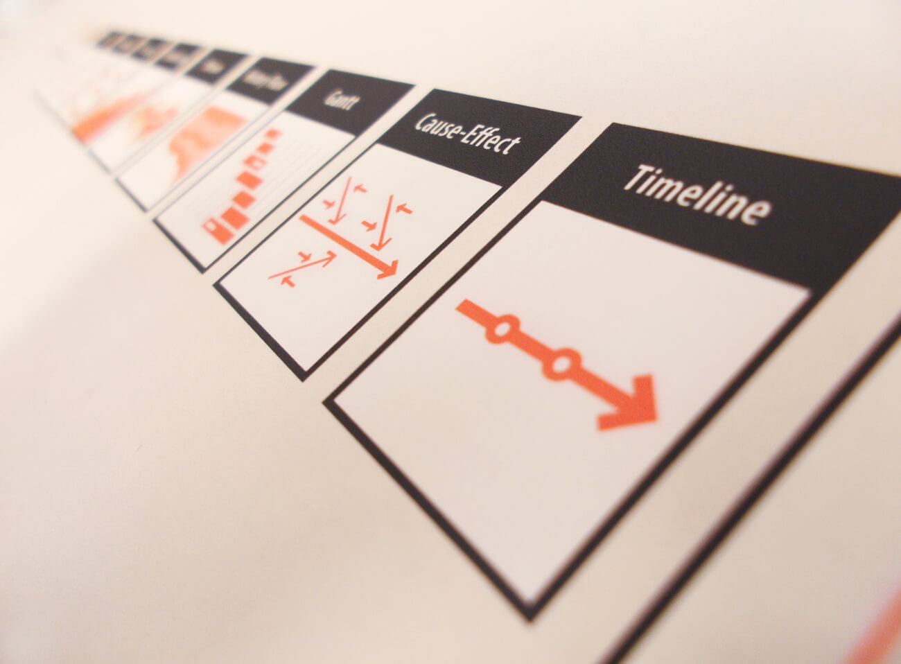
The Graphic Continuum
The Graphic Continuum was originally a research project by Jon Schwabish who runs PolicyViz. The goal of the project was to develop a data visualisation classification system to help assist when deciding on how to display your data. The final product was a 24”x36” poster, which we decided to sell.
This project ended up winning the bronze prize in the KANTAR Information is Beautiful Awards (in the Infographics Category).